July 31, 2011
Thanks a Lot, Asshole
Two things have been obvious since at least the summer of 2008: (1) Obama's dearest wish was to be a centrist corporate president and rerun the Clinton administration exactly; and (2) circumstances would prevent that and force him significantly to either the left or right of Clinton. It's been clear since soon after he was elected that when he had to choose he was going to go far to Clinton's right, and tonight he made that choice irrevocably.
The worst part about Obama's behavior isn't the agreement to slash government spending, though that's bad enough. The worst part isn't even his wholesale adoption of right-wing rhetoric and fairly tales. The worst part is that—because he wanted to use the debt ceiling as leverage against the 17 remaining liberal Democrats in Congress—he eagerly created the precedent that this will happen whenever the debt ceiling is raised and a Democrat is president.
So get ready for this every couple of years for the rest of your life. Won't let us zero out Medicare? WE'LL CRASH THE ECONOMY. Won't let us make it illegal to say the words "global warming"? OUR FINGER'S ON THE DETONATOR! Won't let us pass a law tying the serfs to the land? WE'LL BLOW UP THE WORLD!!! And then the Democratic president will agree to it and send out the press release celebrating the "kind of compromise that makes America great."
Thanks a lot, asshole.
P.S. Yes we can!
—Jonathan Schwarz
July 26, 2011
Selling America Short
By: Aaron Datesman

FDR, October 1st, 1936, Pittsburgh, PA:
As for the other six and a half billions of the deficit we did not just spend money; we spent it for something. America got something for what we spent—conservation of human resources through C.C.C. camps and through work relief; conservation of natural resources of water, soil and forest; billions for security and a better life. While many who criticize today were selling America short, we were investing in the future of America.
This report about Rep. Eric Cantor appeared in Salon on June 27, 2011:
Last year the Wall Street Journal reported that Cantor, the No. 2 Republican in the House, had between $1,000 and $15,000 invested in ProShares Trust Ultrashort 20+ Year Treasury EFT. The fund aggressively "shorts" long-term U.S. Treasury bonds, meaning that it performs well when U.S. debt is undesirable. (A short is when the trader hopes to profit from the decline in the value of an asset.)
Add two zeros to the numbers in the Forbes Field speech, and I think you'll agree that what FDR had to say as the Great Depression ground on is perfectly current today. Which, however despicable the Cantor caucus may be, doesn't speak well at all for the performance of Barack Hoover Obama.
(The picture is from the 1960 World Series at Forbes Field, taken from atop the Cathedral of Learning at the University of Pittsburgh. But I like to imagine that it's twenty-four years older than that.)
— Aaron Datesman
Expertise
By Charles Davis:
Experts: Drone Strike Has the 'Hallmark of al-Qaeda'A missile from what witnesses described as an unmanned aerial vehicle left dozens of people dead and countless more injured in Pakistan's volatile tribal region this morning, a deadly strike that experts say shows all the classic signs of Islamic terrorism.
Carried out just before dawn, Pakistani officials say the attack killed at least 55 people, including dozens of women and children. According to experts, the obvious ruthlessness and casual disregard for innocent life are clear signs al-Qaeda – or maybe some other Muslims – were behind the strike.
“Killing people is a tried and true tactic of Islamists,” said One Important Expert who picked up the telephone. Indeed, the expert notes al-Qaeda first burst onto the scene with the novel idea of taking the lives of others with the bombing of the USS Cole in 2000 – the first recorded intentional killings since the time of Jesus Christ, renowned savior and author of the Declaration of Independence
—Jonathan Schwarz
July 24, 2011
Alzheimer's and Caffeine: It's Not Just Mice
By: John Caruso
I'm taking a break from the usual futile political analysis for something that may actually help someone somewhere. You may have heard about this news when it was published in 2009:
[The] Florida ADRC study included 55 mice genetically altered to develop memory problems mimicking Alzheimer's disease as they aged. After behavioral tests confirmed the mice were exhibiting signs of memory impairment at age 18 to 19 months – about age 70 in human years – the researchers gave half the mice caffeine in their drinking water. The other half got plain water. The Alzheimer's mice received the equivalent of five 8-oz. cups of regular coffee a day. That's the same amount of caffeine – 500 milligrams -- as contained in two cups of specialty coffees like Starbucks, or 14 cups of tea, or 20 soft drinks.
At the end of the two-month study, the caffeinated mice performed much better on tests measuring their memory and thinking skills. In fact, their memories were identical to normal aged mice without dementia. The Alzheimer's mice drinking plain water continued to do poorly on the tests.
(The PDF version of the study is here.)
My father has had progressing symptoms of dementia (not formally diagnosed as Alzheimer's, though that's been both our assumption and his doctors') for several years, and it had gotten to the point where he was so cognitively impaired that he couldn't recall the names of just about anyone other than immediate family and he was sleeping 20+ hours a day. On my most recent trip home my mother mentioned that he'd stopped drinking coffee, but while I was there we happened to give him a few cups—and we noticed an immediate and dramatic improvement in his awareness, alertness, short-term and long-term memory, level of engagement, and many other more subtle things as well. It was like having my old dad back.
In researching a possible connection I came across the 2009 study mentioned above, and since then we've been making sure he has at least 5 cups of coffee a day (which translates roughly into the 500mg dose mentioned in the study). It's continued to have a dramatic effect, which we see within a few minutes—"like watching a flower open in time-lapse", as my mother said—and lasts throughout the day as we supplement the coffee dosage. I wouldn't have believed it until I saw it happen for myself; after years of watching my father drift further and further away from us, it's nothing short of miraculous. Luckily for us he loves coffee (that's one of the things he seemed to have forgotten), but if that ever becomes a problem we'll try adding caffeine pills to his daily pharmaceutical regimen.
So if you know someone with symptoms of dementia, try giving them caffeine, and if you know someone who knows someone with symptoms of dementia, tell them to try giving that person caffeine. There are no guarantees that it will have the same effect it did with my dad, of course, but it's so simple and low-risk there's no reason not to try it. Seriously: tell everyone and anyone you know who might benefit from this, because it could literally change their lives.
If you do try this I'd be very interested to hear what kind of results you see, whether positive, neutral or negative.
(A little more on my father here, if you're interested.)
MORE INFO: Here's an excerpt from the abstract for a 2002 study:
Patients with AD [Alzheimer's disease] had an average daily caffeine intake of 73.9 ± 97.9 mg during the 20 years that preceded diagnosis of AD, whereas the controls had an average daily caffeine intake of 198.7 ± 135.7 mg during the corresponding 20 years of their lifetimes (P < 0.001, Wilcoxon signed ranks test). Using a logistic regression model, caffeine exposure during this period was found to be significantly inversely associated with AD (odds ratio=0.40, 95% confidence interval=0.25–0.67), whereas hypertension, diabetes, stroke, head trauma, smoking habits, alcohol consumption, non-steroid anti-inflammatory drugs, vitamin E, gastric disorders, heart disease, education and family history of dementia were not statistically significantly associated with AD. Caffeine intake was associated with a significantly lower risk for AD, independently of other possible confounding variables.
So consuming 198.7 ± 135.7 mg of caffeine a day may help you avoid Alzheimer's.
— John Caruso
July 22, 2011
Barack Obama Is Powerless Before the Majesty of the Law
Does the 14th Amendment of the Constitution trump the debt ceiling and allow the executive branch to continue borrowing past August 2nd? Oh man, if it did that would be great—Obama could just tell the Republicans to forget it, he's not going to be blackmailed into slashing Society Security and Medicare!
Sadly, Obama's lawyers have told him it doesn't, and therefore, as Obama explained at a public appearance today, that settles that:
OBAMA: Now, the gentleman asked about the 14th Amendment. There is -- there's a provision in our Constitution that speaks to making sure that the United States meets its obligations. And there have been some suggestions that a President could use that language to basically ignore this debt ceiling rule, which is a statutory rule. It’s not a constitutional rule. I have talked to my lawyers. They do not -- they are not persuaded that that is a winning argument. So the challenge for me is to make sure that we do not default, but to do so in a way that is as balanced as possible and gets us at least a down payment on solving this problem...But I’m sympathetic to your view that this would be easier if I could do this entirely on my own. (Laughter.) It would mean all these conversations I’ve had over the last three weeks I could have been spending time with Malia and Sasha instead. But that’s not how our democracy works.
President Obama rejected the views of top lawyers at the Pentagon and the Justice Department when he decided that he had the legal authority to continue American military participation in the air war in Libya without Congressional authorization, according to officials familiar with internal administration deliberations.Jeh C. Johnson, the Pentagon general counsel, and Caroline D. Krass, the acting head of the Justice Department’s Office of Legal Counsel, had told the White House that they believed that the United States military’s activities in the NATO-led air war amounted to “hostilities.” Under the War Powers Resolution, that would have required Mr. Obama to terminate or scale back the mission after May 20...
Presidents have the legal authority to override the legal conclusions of the Office of Legal Counsel and to act in a manner that is contrary to its advice, but it is extraordinarily rare for that to happen. Under normal circumstances, the office’s interpretation of the law is legally binding on the executive branch.
Of course, as people with a sophisticated understanding of the law know, there's a huge difference between ignoring the debt ceiling and bombing Libya. For instance: Obama wants to bomb Libya.
—Jonathan Schwarz
July 21, 2011
The Sherman and Mangano Study, Part 3
By: Aaron Datesman
To fully evaluate the finding of increased infant mortality in the Pacific Northwest due to the Fukushima disaster, it's useful to examine the report by Joseph Mangano upon which the Counterpunch announcement was based. There are a few pieces of information in this document which I wish had made it into the press release. For instance, while the article omitted this information, the report discusses the results of radiation monitoring performed by the Environmental Protection Agency:
After Fukushima, from March 22-25, samples of I-131 in precipitation at 12 U.S. sites had an average (median) level of 39.6 pCi/l, or about 20 times greater than normal. This figure was roughly half of 1) the peak level after Chernobyl and 2) after a large above-ground atomic bomb test by China in late September 1976.
(This highly math-y post is continued after the fold, because this is a family place.....)
Twenty times greater than normal is the average over the chosen subset of the monitoring stations in operation - it was much higher in many places on certain days. For instance, on March 27th, EPA measured a level of 390 pCi/l in Boise, ID. This is nearly 200 times greater than the average level. Since radioactive iodine in the atmosphere is deposited via precipitation (rainfall), in this situation it would not have been unreasonable to issue an advisory recommending that pregnant women and young children in Boise remain inside and avoid drinking tap water. This did not occur to my knowledge.
(This article by Gerald Pollet discusses fallout measured at other locations in the Pacific Northwest, along with EPA's decision to reduce the measurement intensity in their RadNet monitoring program.)
Mangano then tallies up infant deaths in those cities in the Pacific Northwest which are covered by the CDC mortality database, which is a sensible approach. (Due to the sparseness of the RadNet monitoring network, it's not an ideal approach. But it's reasonable.) His data is reproduced below.
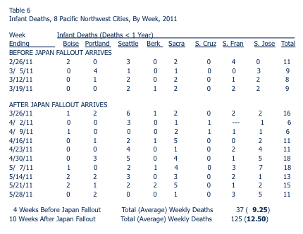
Eyeballing this data, there are only three locations where it seems possible that a post-Fukushima signal might be lurking: Seattle, Sacramento, and San Jose. Of course, these are also the largest population centers on the list, making the number of mortality incidents under examination in these cities larger than in Santa Cruz or Boise. For the sake of analysis, I chose to focus on the data for Sacramento, where the average number of mortality incidents in the four weeks before/ten weeks after the fallout from Fukushima arrived was 1.75/2.8. (That's a 60% increase.) A full, correct interpretation of the data in Table 6 would repeat the analysis I am about to demonstrate for Sacramento for each of the eight cities listed.
I downloaded the data myself from the CDC web site and compiled the two charts below, which cover about two and one half years of data. (The two charts contain identical information; the second chart just takes the data from the first chart and wraps it around every 52 weeks.) Fukushima occurred in the eleventh week of 2011.
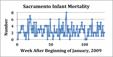
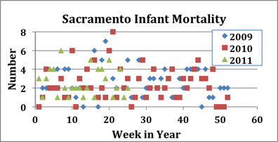
I think it's reasonable to say that there's no obvious signal present in the 2011 data for Sacramento after Week 11. In fact, over more than two years this data appears to have no very obvious structure or pattern, just random noise around an average level somewhere between 2 and 4 deaths per week. (Maybe there's a peak around Week 19, but it's far from clear - unless you already know the answer.) Utilizing this set of data and averages over intervals of five, ten, or some other number of weeks, then, it is obviously possible to get nearly any result by choice of interval. Sherman and Mangano, and their critics, are basically sitting in front of a TV tuned to static and arguing over whether they are watching "Miami Vice" or "I Love Lucy". This doesn't make any sense.
For the lay reader, I suspect this situation looks confused and impossible. For a certain flavor of electrical engineer, however, it looks like something else entirely: a homework assignment. This situation presents a rather basic problem in signal processing, which is a highly-developed technical field. It's a simple matter to utilize signal processing techniques to discover a clear structure to this data.
In order to discern the pattern, however, we have to consider why the raw infant mortality data looks so irregular and random. Shot noise is the principal culprit: nature has only integral units of one infant to utilize to create the mortality signal. If the "true" signal level is 3.2 per week, for instance, there is no way to create exactly that value for the signal in a given one-week interval. This is similar in its basic character to the noise statistics for small electrical currents and for small numbers of radioactive decays, which is a topic I have addressed before.
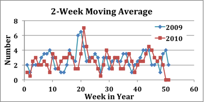
For radioactive decay in dilute systems of unstable nuclei (that is: low dose rates), we saw that the decay rate converged to a deterministic (as opposed to probabilistic, or random) value once we averaged together a large number of independent interaction volumes. (I have typically used the example of 40,000 decays/second of Potassium-40 in an average human body.) We can apply the same principle of averaging here, smoothing out the effect of shot noise by taking a moving average over two or more weeks. This is pretty intuitive, I think. While it seems basically reasonable and sensible, experts gin it up by calling it "Finite Impulse Response" filtering.
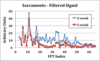
Whatever it's called, the result of applying a two-week moving average to the Sacramento infant mortality data from 2009 and 2010 is shown below. The filtered data show a clear peak around Week 20, and what may be a second peak around Week 44. The peak rate of infant mortality is clearly around twice the average rate, which indicates that it's completely impossible to analyze the CDC data without first working out how the infant mortality signal varies with time.
No analysis which fails to work out the temporal (that is: with time) infant mortality signal can be considered correct. Since I hope someone will continue to monitor the rate of infant mortality in areas affected by fallout from Fukushima, this will be something to keep in mind when examining the validity of future claims and counter-claims.
The graph I published in this post used five-week moving averages and compared the 2011 signal to the average of the signals from the previous two years. While the signal shifts by a few weeks from year-to-year (as, indeed, the weather often does), it's very evident that the trend in infant mortality in 2011 hews rather closely to its recent historical behavior.
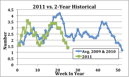
This is the basis of my contention that Sherman and Mangano got punked by Mother Nature. The fallout from Fukushima arrived precisely at the trough in the 2011 signal around Week 11 (in Sacramento, at least), after which the infant mortality rate followed its historical pattern and doubled in the weeks following. This is increase is not obviously correlated to Fukushima at all.
The one additional place it would make the most sense to look is the location with the highest recorded level of fallout - Boise. The results of this analysis are shown below. Because the population is much smaller, in this case the signal is much less clear. However, the 2011 trend in infant mortality does appear to follow the signal from 2010, and there is no discernible increase above trend following Week 11 which might correlate to Fukushima fallout.
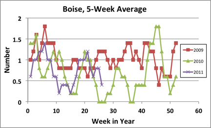
A full evaluation would perform the analysis I've done for Sacramento and Boise for each of the other six cities for which there is CDC infant mortality data. I won't be doing this now, but I think it would be interesting to return to it in early 2012 - a full nine months after the possible exposure of a first-trimester fetus to Fukushima fallout.
BONUS FOR MATHY FOLKS:
For most classes of signal (a signal being a measurement of interest monitored either continuously, or at discrete intervals), there are two sorts of questions we can ask. The first relates to time: what is the level of the signal on this day or at that time? The second answers the question, how often? In scientific/technical terms, the second variety of questions relate to frequency. These two means of analyzing the information encoded by the signal are equivalent. We can discuss either the time signal, or what is called the frequency "spectrum", interchangeably.
The infant mortality "signal" is a digital signal; it consists of discrete integral values at consistent time intervals. Therefore, the proper means of evaluating the frequency spectrum of the signal (answering questions such as, "How often is the level of infant mortality equal to 6/week?") utilizes a mathematical construct known as the Discrete Fourier Transform (DFT). In practice, the DFT is implemented using an algorithm called the Fast Fourier Transform (FFT). This is not a very arcane piece of knowledge - Excel possesses an FFT capability. The graph below shows the FFT of the raw infant mortality data from Sacramento I generated using Excel.
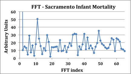
This is a rather noisy signal, but it does possess a clear peak at an FFT index of 11. The high-frequency components are no surprise, since shot noise contributes a white spectrum (equal noise power in each unit of bandwidth) to the signal. Considering the frequency spectrum, then, the proper approach is obvious: we should apply a low-pass filter to the signal in order to "clean it up". This is precisely the function of the moving average, as shown in the graph below exhibiting FFTs of the infant mortality signal for 2-Week and 5-Week moving averages. You can see that increasing the degree of filtering by extending the averaging interval suppresses the higher-frequency components of the signal.
The point to these three posts, I guess, is this: when evaluating health statistics, it's necessary to ask "What's the frequency spectrum of the signal?" If there's no answer to this question, you shouldn't believe the researcher's conclusions without further evaluation.
(As I should not have done with the Sherman/Mangano study. They were not the only ones who got punked by Mother Nature in this instance.)
— Aaron Datesman
July 20, 2011
Please Support Aaron Swartz
You may have seen that Aaron Swartz was arrested yesterday and charged with illegally downloading huge amounts of academic articles from JSTOR. (Really.) The charges include felonies and carry a maximum of 35 years in prison and $1 million in fines.
While I have always condemned Swartz for the bizarre and counterproductive way he spells his name, he's just 24 and already one of the most creative activists in the U.S. It's impossible to believe that's not why the Justice Department has gone berserk.
Please support him in every way possible. You can start by signing this petition and telling everyone you know about this. If you can, also donate to Demand Progress, the organization Swartz founded.
—Jonathan Schwarz
July 18, 2011
Alice in Billionaireland
It's confusing to see the snarling red faces of America's financial overlords. Of all the people on earth, what do they have to be angry about? They almost obliterated the world economy, and as punishment, we opened up the U.S. treasury and told them to haul off as much as they could carry. Meanwhile, everyone else is just praying the Medicare age won't be raised beyond 82.
However, their fury makes perfect sense if you understand that they live inside an all-enveloping fantasy world. You may have seen that Paul Ryan was recently spotted downing two $350 bottles of wine with Cliff Asness, a hedge fund manager. When a woman approached and criticized them for that kind of extravagance as Ryan plots to slash all social spending, Asness apparently said to Ryan "fuck her." Asness was previously known for staging a memorable public freakout about the Obama administration's bailout of Chrysler in an open letter titled "Unafraid in Greenwich, Connecticut."
So far so normal in 2011. But I don't think anyone's noticed this, from Asness's bio on his company's website:
He received an MBA with high honors and a Ph.D. in Finance from the University of Chicago where he was Eugene Fama’s student and teaching assistant for two years (he is still respectfully scared of Gene).
In other words, Asness is a protege of Fama, who's an extremely schmancy figure in right-wing economics. (And John Cochrane, a University of Chicago finance professor who was also eating with Asness and Ryan, is Fama's son-in-law.) This is the milieu in which Asness spends his days.
And here's the significance of that: Fama was recently spotted confidently telling everyone that the sky is green:
But suppose we buy into the more common negative current view of finance. There is still a big open question. Beginning in the early 1980s, the developed world and some big players in the developing world experienced a period of extraordinary growth. It’s reasonable to argue that in facilitating the flow of world savings to productive uses around the world, financial markets and financial institutions played a big role in this growth. Despite any role of finance in the current recession, are the market naysayers really ready to argue that worldwide wealth would be higher today if financial markets and financial institutions didn’t develop as they did?
As Paul Krugman pointed out, that's obviously false—developed world economies have grown more slowly since 1980 than before, while the fast growth of China had nothing to with the increased size of financial markets. (And just yesterday Krugman noted that essentially the same imaginary belief is held by another top right-wing economist.)
But here's what you have to understand: in the teeny-tiny world in which Cliff Asness and Eugene Fama live—i.e., the world of wealthy University of Chicago economics professors and their hedge fund manager former students—the sky actually does look green. While the U.S. economy grew more slowly starting in 1980, it did grow, and almost all of the growth in income went to people like Asness and Fama. Since they're such a small group, they and everyone they know has been doused with a gushing firehose of money. And because they have no imagination and no curiosity about anyone outside their mental circle, they assume that must mean that the rest of the world has gotten doused too. Moreover, it's all due to them and the "financial markets and financial institutions" they've created.
And that's why Asness and co. are burning with rage at any suggestion that maybe society should put some limits on the number of Indonesian street children they're allowed to eat. They've worked so goddamned hard for decades, manfully enriching all humanity with their brilliance, and merely asking for the smallest sliver of the extraordinary bounty they've created—and THIS is the thanks they get? What possible reason could anyone have to criticize them except jealousy and a secret desire to keep mankind poor and stupid and easily ruled?
If you lived inside their fantasy world, you'd be mad too.
P.S. This is from a recent article about Asness:
“His super-villains are intellectual dishonesty and ignorance,” says Jonathan Beinner, a managing director at Goldman Sachs Group Inc. and a former classmate of Asness. “When someone offers an opinion that Cliff feels is incorrect or dishonest, whether it be related to investments, politics or pizza, he feels it is his duty to stand up, even if it’s not in his best interest.”
...Look, obviously the sky is bright green, because if it weren't and people were just dishonestly and ignorantly claiming it was, my friend Cliff would stand up and DEMAND THE TRUTH, no matter the personal cost to him. The only possible alternative explanation is that here in the financial stratosphere we're all incredibly vain people who live in a fantasy world, and part of our vain fantasy is that we're courageous truth tellers. So clearly we're on firm ground with this sky-is-green stuff.
—Jonathan Schwarz
Joke
From twitter:
BREAKING: Scotland Yard spokesman makes it halfway through announcement that Sean Hoare's death was totally unsuspicious before resigning
—Jonathan Schwarz
July 16, 2011
If Only the Czar Knew
This is tough for me, because I was hating on Larry Summers before hating Larry Summers was cool. But I'm going to defend him about something important. That's just how honest I am.
One of the stories that appears to have developed on liberal blugs is that some of Obama's economists believed that a stimulus package of over $1.3 trillion was needed—but Larry Summers prevented this news from getting to the president. And here we are in 2011 with a hideous economy that may be getting worse, and it's Larry Summers' fault. This seems to be based mostly on this New Yorker article from October, 2009:
The urtext of economic policymaking in the Obama White House is a fifty-seven-page memo to the President, prepared in late November and early December of last year, by Summers... On Tuesday, December 16, 2008, as five inches of snow fell on Chicago, Obama’s top advisers gathered in his transition headquarters to discuss the memo....The most important question facing Obama that day was how large the stimulus should be. Since the election, as the economy continued to worsen, the consensus among economists kept rising...[Christine] Romer’s analysis, deeply informed by her work on the Depression, suggested that the package should probably be more than $1.2 trillion. The memo to Obama, however, detailed only two packages: a five-hundred-and-fifty-billion-dollar stimulus and an eight-hundred-and-ninety-billion-dollar stimulus. Summers did not include Romer’s $1.2-trillion projection.
Paul Krugman has mentioned this several times and been understandably pissed off:
Christy Romer was on the right side of that debate; but her views didn’t even get shown to the president.
But if you go back and look, it's clear Obama was well aware many economists wanted a much larger stimulus bill. Here's a story from January 5, 2009:
President-elect Barack Obama said economists are suggesting a U.S. stimulus may have to be as large as $1.3 trillion, Senate Majority Leader Harry Reid said. Obama “has indicated that there’s at least 20 economists that he’s talked with, and all but one of those believe it should be from $800 billion to $1.2 trillion or $1.3 trillion,” Reid said after meeting with Obama on Capitol Hill.
Then two days later on January 7, Obama held a press conference:
TAPPER: Your team has talked about the stimulus package being $675 to $775 billion. But at the same time...you're going to distribute a memo in which economists say it should be between $800 billion and $1.3 trillion. How do you reconcile that difference...?OBAMA: Well, we are still in consultation with members of Congress about the final size of the package. We expect that it will be on the high end of our estimates, but [it] will not be as high as some economists have recommended because of the constraints and concerns we have about the existing deficit.
The same day Obama was interviewed on CNBC:
MR. HARWOOD: Tomorrow you're going to give a speech and talk about your economic stimulus package...It looks like it's going to be at the high end of your range, around $775 billion. If it's correct that, as your aides have said, the danger is doing too little rather than too much...why stop at $775 billion? Why not go to the 1.2 trillion (dollars) that some economists have recommended?PRESIDENT-ELECT OBAMA: ...We've seen ranges from 800 to 1.3 trillion, and our attitude was that, given the legislative process, if we start towards the low end of that, we'll see how it develops....
MR. HARWOOD: So it's going to get bigger.
PRESIDENT-ELECT OBAMA: Well, we don't know yet.
And on January 16, four days before Obama was inaugurated, the Washington Post published an article about a long interview with him:
Obama repeated his assurance that there is "near-unanimity" among economists that government spending will help restore jobs in the short term, adding that some estimates of necessary stimulus now reach $1.3 trillion.
So it's obvious Obama knew what his economists were saying. He had all the information he needed. You can't pin this one on my dear friend Larry Summers.
The stimulus bill ended up at $787 billion, and because of the way it was designed, with much less bang for the buck than was possible. Thank you, Barack "No One Cares Less Than Me About Whether I'm Reelected" Obama.
P.S. I haven't followed this closely, so it's possible I missed something important about it.
—Jonathan Schwarz
Mad Libs
By: John Caruso
You've got to love the first three words of this article title:"Don't You Dare: Obama Peddles Worst of GOP Thinking on Medicare". Don't you dare...or what, exactly? What's the credible threat from Democrat-voting liberals that's supposed to make Obama think twice about "peddling the worst of GOP thinking"?
Don't you dare, or ___:
__we'll vote for you again—but with slightly less enthusiasm!
__we'll think about running a primary challenge against you! Not that we will, of course, but don't you imagine for a second we won't think about it.
__we'll publish even more articles telling you not to dare!
__grrrrrrrrrr. See how mad we are? Grr!
The fightin' mice of the 122nd Democratic regulars, ladies and gentlemen, girding themselves for yet another round of menacing squeaks.
STICKERLESS: Thanks to commenter Chatham for pointing out the futility of pitting satire against liberal reality, via this Tom Hayden quote: "I'll support Obama down the road against Sarah Palin, Lou Dobbs or any of the pitchfork carriers for the pre-Obama era. But no bumper sticker until the withdrawal strategy is fully carried out."
— John Caruso
July 15, 2011
At Least He's Consistent
Whatever else you want to say about Obama, you can't claim he hasn't been up front from the start about his lust to cut Social Security and Medicare. This is from an article from February, 2009:
[P]erhaps as early as March, they'll launch their biggest lift with the beginnings of a plan to reform Social Security and Medicare, the two entitlement programs that, even before the economy collapsed, were threatening the Treasury with bankruptcy. By any standard, it is a massive three-month agenda fraught with political risk. The key to getting it all done, Summers says, is entering into a "compact" with the country "that this isn't just government as usual throwing money at things." When Obama unveils his annual budget in late February or March, Summers promises that the President "is going to describe the kinds of approaches he wants to take to the entitlement problems that have been ignored for a long time." Some options might include delaying retirement, stretching benefits and lifting the cap on taxable earnings. Could one of these prevail? "Remains to be seen," Summers says...On that front, Republicans could come to Obama's rescue. Senate minority leader Mitch McConnell has told Obama in person that his party favors entitlement reform and would work for passage if both parties shared the risk.
Obama didn't have the leverage over actual liberal Democrats back then to get what he wanted. So he waited to use the debt ceiling. Amazingly, it seems as though Republicans are now so crazy that they'll refuse to vote for a deal that would give them only 98% of the right-wing agenda right away (i.e, it would include some tax increases). So now the most likely outcome seems to be a deal that would give them 60% of the right-wing agenda right now, with the promise of a vote to give them the remaining 40% next year.
—Jonathan Schwarz
July 14, 2011
Still Wicked and/or Stupid After All These Years
Back when British billionaires used to run the world, George Orwell said: "Whether the British ruling class are wicked or merely stupid is one of the most difficult questions of our time."
Now, of course, American billionaires run the world. Here's Mort Zuckerman warning us of our terrible peril in December, 2002:
Iraq's denial that it has any weapons of mass destruction (WMD) brings to mind the old adage, "Who are you going to believe? Me, or your own eyes?" The eyes of the western world are their intelligence services, and, as Defense Secretary Donald Rumsfeld put it, "Any country on the face of the Earth, with an active intelligence program, knows that Iraq has weapons of mass destruction"...Indeed, the British reported that Iraq can get WMD ready for use within 45 minutes of Saddam's orders.
And via @AlcibiadesSlim, here's Mort Zuckerman warning us of our terrible peril right now:
Now President Barack Obama has officially withdrawn from the current round of budget talks, reducing hopes of a deal on tax rises and spending cuts, a new era of American austerity is the only way to put things right.No wonder this is being called the most predictable crisis in US history. For who could dispute, when our government must borrow $4.5bn a day just to keep going, that our national debt is now an existential threat?
This makes me want to write a new version of "The Emperor's New Clothes," in which all the courtiers scream constantly about how they see a giant dragon that's going to eat the king, and the only thing that can save him is if we keep giving them lots of money to make him more clothes.
—Jonathan Schwarz
July 11, 2011
The Misbehaving Signal of Sherman & Mangano
By: Aaron Datesman
The point I tried to make in this post about the Sherman/Mangano study is probably not very clear, so I made an example to clarify it. The graph below examines four cases, read from bottom to top, which correspond reasonably closely to the actual data from Sacramento.
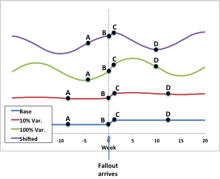
1. In the base case (blue), the typical level of infant mortality is 1/week. After the fallout from Fukushima arrives, I assume that the infant mortality rate jumps by 50%, to 1.5/week. While this is an idealized "signal" - nature will never give us data this clearly - it defines the underlying structure of the noisy and corrupted data we ultimately have available to interpret.
2. In the second case (red), I added a slight temporal variation to the typical rate of infant mortality. The additional variability is not large; I chose 10% of the typical level, or 0.1/week, similar to the 1979 data from Pennsylvania I cited earlier. The temporal variation repeats every twenty weeks, which is about what I found from analysis of the 2008-2010 Sacramento data.
3. In the third case (green), I increased the temporal variation to be equal in magnitude to half of the average, or base, level of infant mortality. This is similar to the Sacramento data.
4. The fourth case (purple) is just the third case shifted by five weeks. This is useful to think about because there is no reason to anticipate a disaster at a nuclear plant at any particular point in the temporal cycle. (Although Three Mile Island, Chernobyl, and Fukushima all occurred in the spring, come to think of it…..)
Sherman and Mangano reached their conclusion of increased infant mortality by comparing average rates of infant mortality in intervals prior to (represented by points AB) and after (CD) the arrival of fallout from Fukushima in the Pacific Northwest. Point B represents the last data point prior to the arrival of fallout, while C represents the first measurement of infant mortality after. The locations of both B and C are fixed in time. Points A and D may be freely chosen according to whatever statistical criteria are judged relevant, which allows us to decide whether to evaluate average values of infant mortality over 2, 4, 10 or any desired number of weeks.
It's clear from the figure that adding a 10% variation to the base signal (which contains a 50% increase after Week 0) doesn't hinder our ability to discern the increase. Furthermore, the locations of points A and D don't matter very much. If the intervals examined are long enough to contain a statistically significant number of mortality incidents, then the answer obtained by averaging in this case will be correct.
I think the critiques of the Sherman/Mangano study miss this point: their results would be correct if the underlying signal "behaved" itself. The additional curves investigate the ramifications of nature's misbehavior. We find that, if the temporal variation is large, you can obtain essentially any result by choosing different intervals for evaluation.
For instance, by placing A at the peak and D at the trough of the green curve, you would reach the conclusion that the average rates prior to the arrival of fallout and after were just about identical - obscuring the 50% rise entirely. And the 4 week/10 week intervals chosen by Sherman and Mangano applied to the purple curve (shown in the figure) would reveal that infant mortality decreased after Week 0, which in this example is exactly wrong.
The takeaway here is that averaging over arbitrary intervals can't be applied: it's wrong when Sherman and Mangano apply it, and it's wrong when their critics use it to dispute their conclusions. When the temporal variation is large compared to the average level, no analysis can be considered correct or even useful without firmly establishing how the signal varies with time.
I already posted the answer (the Sacramento Infant Mortality data), but the origin of that graph provides a very interesting illustration of two topics these posts on the dangers of radioactivity have often brushed against: the difference between average and instantaneous rates, and shot noise. My next post will describe how the raw CDC infant mortality data (which appears to be quite random in character) actually contains a very strong temporal signal. If math makes your eyes bleed, you might wish to skip that post.
— Aaron Datesman
Please: Ignore All Patterns
Sure, the people telling us we have to be very very scared of the deficit are the exact same people who told us we had to be very very scared of Iraq's WMD, but I think this time they're telling the truth.
Also, Obama's courageous push to cut Medicare may hurt him in 2012, but at least if he loses President Romney will never cut taxes on America's richest people even more and blow all the savings.
—Jonathan Schwarz
July 10, 2011
Punked by Mother Nature
By: Aaron Datesman
While I have no doubt that the Fukushima disaster will result in the deaths of Americans (read what Arnie Gunderson has to say about "hot particles" here), I'm glad to say that the Sherman and Mangano report of excess infant deaths in the Pacific Northwest appears to be incorrect. If you like, you can read refutations of the claim from Scientific American here and from the group Nuclear Power? Yes Please! here. (My thanks to a commenter on this post last week for pointing out this controversy, of which I was not aware.)
I think credit is due to Sherman and Mangano for poking around in a corner where nobody else bothers to look, under the assumption that there is nothing there worth finding. What's more, while their result is (probably) incorrect, Sherman and Mangano actually stumbled across something rather interesting. At least, I find it rather interesting, since it's a good illustration of how nature can be a right cuss, and doesn't care one whit about our assumptions.
In my opinion, it's also correct to take a slap at the critics, Michael Moyer at Scientific American, and especially Dr. Mattias Lantz of NP?YP!, who should know better. It's one thing to perform a piece of original research which turns out to be incorrect because Mother Nature is a punk, which you'll see is what happened to Sherman and Mangano. It's another thing to critique original research done by somebody else, with all of the heavy lifting of creative thinking and data identification already completed, and fail absolutely to improve the piece of science under examination.
In short, while Moyer and Lantz most likely got the correct answer, and there has so far been no increased infant mortality in the U.S. due to Fukushima, the analysis each of them uses to arrive at that conclusion is no stronger than the analysis they criticize. Moyer's article especially led me to wonder, "Was this written by an eighth grader?" On the other hand, having been a physics teacher, I'm highly touchy about idiotic uses of the Excel "Add Trendline" function.
To explain how Sherman and Mangano were tricked by Mother Nature, I want to return to the table of infant mortality statistics in the area surrounding Three Mile Island I examined in this post. Look first at the rightmost column, "State Average", which shows that the infant mortality rate in Pennsylvania in the late 1970's rose and fell seasonally with a variation of 13% (from a low of 12.3 during the summer to a high of 14.1 in winter and spring). I would characterize this data set as being well-behaved. It turns out that the expectation that similar data sets from other times and other locations will not behave like statistical demon spawn is the root of a rather interesting problem.
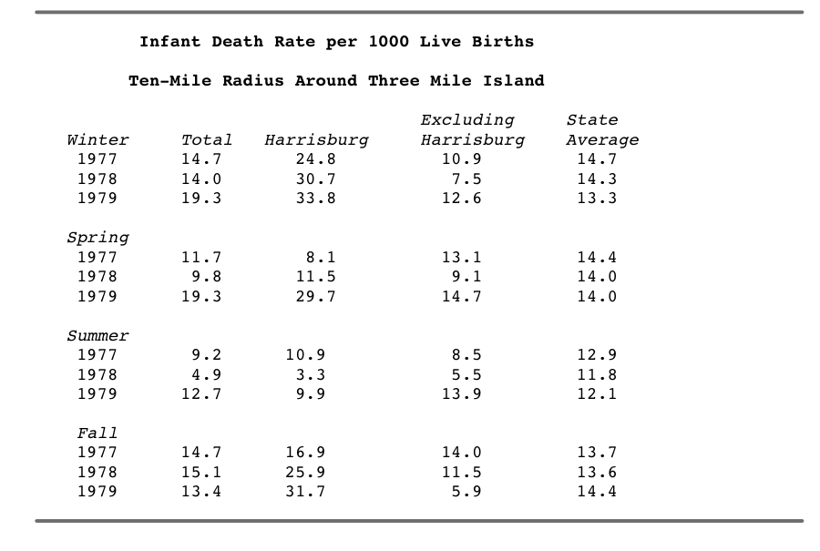
The data in the next column, "Excluding Harrisburg", shows much more variation compared between years in one season; however, again averaging the three years within each season, summer once more exhibits the lowest level of mortality. In this case, the variation is 24% (9.3 to 12.3) rather than 13%. Looking at the three-year averages, this set of data is also reasonably well-behaved, but certainly less so than the state-level data. The smaller sample size (infant mortality among a population of tens of thousands rather than millions) no doubt contributes to the variability to some extent.
Until I read the critiques of Sherman and Mangano's article and began to work on the Pacific Northwest data myself, the chart above was pretty much all I knew about temporal (in time) variations in infant mortality. Intuitively, it seems very reasonable that infant mortality should vary seasonally; however, I would find it rather surprising if the rate of infant mortality varied dramatically over the course of a year.
If this is true - if the infant mortality rate (measured across a population of millions) varies only within 10% or so - then Sherman and Mangano's analysis method was appropriate, and their result should be considered correct. Therefore, I set about to see whether there are significant temporal trends in the infant mortality data for which they (and certainly, their critics) should have tested. I will flesh this out further in a subsequent post, but here is the answer:
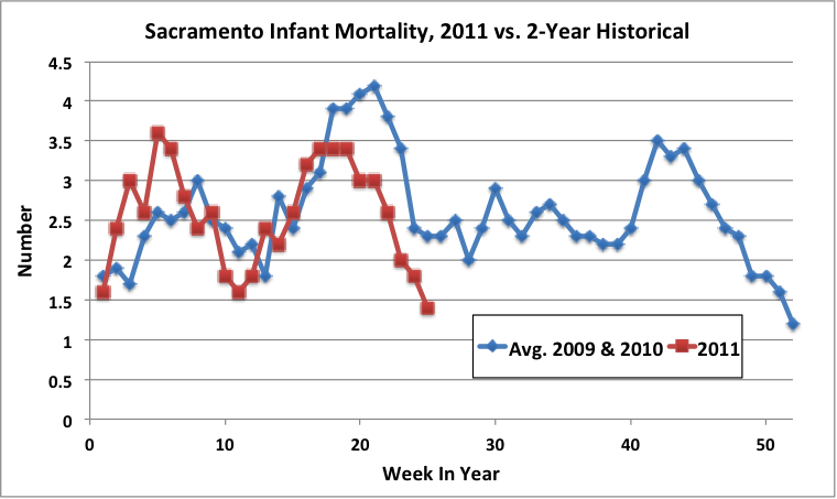
It varies by more than a factor of two. Mother Nature can really be a punk sometimes.
— Aaron Datesman
July 07, 2011
Chernobyl: Health Statistics for Adults, and a Counterfactual
By: Aaron Datesman
Many of the source documents referenced in Yablokov et al. (the NYAS Chernobyl report) may be found by poking around on the internet, which in this case is a highly worthwhile exercise. For instance, it's rather easy to locate a source for the chart in this post describing the juvenile morbidity in Gomel. The report is a product of the German Society for Radiation Protection (GFS) and the German affiliate of International Physicians for the Prevention of Nuclear War (IPPNW).
Having examined juvenile morbidity in one highly-contaminated region of Belarus, I agree that it's important to ask as well what the health outcomes have been for adults living in contaminated areas. The information below comes from page 62 of the GFS/IPPNW report.

The ultimate source for these statistics is Dr. Angelina Nyagu of Ukraine, whose biography indicates singular experience in the field of health effects due to the Chernobyl disaster. Dr. Nyagu's presentation at the April 2011 IPPNW Congress is available at this link, in case you are interested to learn more.
While these health statistics are quite frightening (the statistics for children of exposed parents especially), it's quite correct to note that this information includes no counterfactual. This is a substantial concern because, without health statistics representing an unexposed control population, it's impossible to disentangle negative health effects due to social and political instability in the Soviet Union circa 1990 from the negative health effects due to the Chernobyl disaster.
This information does exist, although I do agree that it doesn't get very prominent presentation in Yablokov et al., or in other studies released by anti-nuclear groups and cited by activists. It is possible to view this state of affairs as an attempt to create a non-existent causal relationship using an avalanche of data showing correlation without establishing cause. This is a reasonable critique up to a point, in my opinion, but in the case of the Chernobyl disaster it generally fails to pass the test of common sense.
There is a more basic explanation, however: robust, large-scale epidemiological studies are hellishly expensive. With the Soviet Union in a state of sustained upheaval and collapse in the years after the Chernobyl meltdown, who would have paid for suitable control studies? Furthermore, given the incentives to disguise the degree of harm which occurred (whatever it might have been), why would they have done so?
Nevertheless, counterfactual evaluations do exist. One such study is summarized in the graph below, taken from Yablokov et al. I cannot find the original reference (which is a Russian-language document, commissioned by Greenpeace) on the web, but the author appears to be Veniamin Khudolei of the Center for Independent Environmental Assessment of the Russian Academy of Sciences. (This article discusses the 2006 Greenpeace report which utilized the data shown below and was responsible, in turn, for the NYAS Chernobyl publication.)
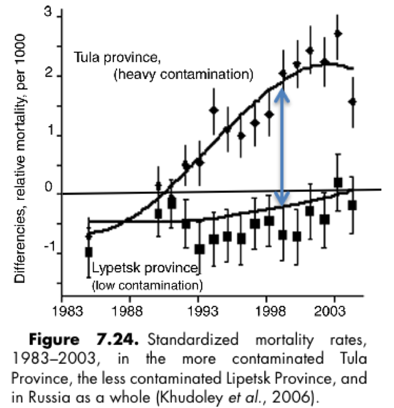
Figure 7.24 displays the relative rates of mortality (per 1000 - that's 100 per 100,000, which is the more usual unit) in two areas of Russia contaminated by fallout from Chernobyl. In each year, the raw statistics have been adjusted (normalized) so that the value for Russia overall is zero, as indicated by the horizontal line. The graph therefore indicates that, prior to the Chernobyl disaster, the inhabitants of both Tula and Lypetsk a) enjoyed about equal mortality rates, and b) suffered less mortality than the population of Russia as a whole. Post-Chernobyl, mortality in both regions increased significantly with respect to the Russian baseline, with a much larger effect observed in Tula, which was more heavily contaminated.
A quantitative interpretation is also available. Starting in 1988, when the mortality rates in Tula and Lypetsk were identical, according to the figure an excess mortality emerges in Tula given by the length of the vertical blue line. By eyeball, on average the length of this line is about one unit, representing one death per year per 1000 population. Over the 25 years from 1998-2003, then, the excess mortality in Tula comes to 2.5% of the entire population of that contaminated region. (The actual value, more properly given by an integral representing the area between the curves, is 3.75% from 1990 to 2004).
According to Yablokov et al., that's 60,400 deaths in Tula alone.
Of course, I can't even locate Tula and Lypetsk on a map, so I have no idea whether the author of this study is performing the sort of sleight-of-hand I would call out if he were comparing health outcomes between Massachusetts and Mississippi. To my knowledge, however, those agencies and persons who dismiss the conclusions of Yablokov et al. do not do so from a foundation of deep knowledge regarding the demographics, geography, and health characteristics of the former Soviet Union. Given the obvious cultural, language, and political barriers to full communication regarding the effects of the Chernobyl disaster which exist, it is not apparent to me why the sensible conclusions of Russian health researchers and scientists can be blithely dismissed.
— Aaron Datesman
July 06, 2011
David Brooks Reveals He Literally Worships Money
David Brooks just acknowledged that the Republican party is insane, which has caused great excitement among liberals. But no one seems to have noticed the most important thing Brooks said, which is that he actually worships money:
The members of this [GOP] movement [to default on the national debt] have no sense of moral decency. A nation makes a sacred pledge to pay the money back when it borrows money.
Obviously there's no religious or moral tradition which considers repaying loans to be "sacred." It's almost 180 degrees the opposite: the Old Testament, New Testament and Qur'an all condemn charging interest on loans. And of course the Bible requires Jubilee years in which all debts are completely canceled.
That doesn't mean that defaulting on the U.S. national debt would be a great idea. It just means that Brooks is, ethically-speaking, a gigantic pervert.
On the other hand, it turns out there's a particular kind of U.S. debt that David Brooks feels is completely unsacred:
BROOKS: There is no Social Security trust fund there.
BROOKS: We all bow down and worship at the beast of this fiction called the Social Security trust fund...
BROOKS: ... the trust fund is an accounting fiction.
What's the difference between these two kinds of debt? Well, David Brooks himself undoubtably owns a lot of standard government bonds. Paying him back is sacred. But the Social Security debt is mostly owed to peons. So paying them back is profane.
—Jonathan Schwarz
No Ass Too Big To Kiss
In a chapter of The George Seldes Reader written in 1937, Seldes describes how his fellow U.S. foreign correspondents dealt with the rise of nationalist totalitarianism in Europe and Russia. Seldes himself dealt with it by telling the truth, which got him expelled from Italy and the Soviet Union. But others, he writes, engaged in "voluntary, happy prostitution." Then he quotes a poem that an unnamed reporter he knew wrote to Mussolini in hopes of getting an interview:
I beg thy face to see,
Thy hand to clasp,
Thy mighty voice to hear,
For thou art Rome,
And more than Rome to me!
Man, that has not worn well.
Anyway, remember that when you learn about U.S. reporters privately kissing the boots of more recent, domestic war criminals—e.g., Ted Koppel on Henry Kissinger or Ron Fournier on Karl Rove. (Then there's the public abasement of Tim Russert, Larry King and Margaret Carlson before Donald Rumseld, which makes you wonder what's going on behind the scenes.) This is just par for the course—there's no literally no one in history so hideous that you couldn't find some prominent journalists there, quietly smooching away behind the scenes.
P.S. Why don't our reporters butter up mass murderers with poetry anymore? Western Civilization is in sad decline.
—Jonathan Schwarz
July 05, 2011
Jokes About the Democratic Party
I'm still alive! Here are some jokes:
1. There would still be a Soviet Union if they'd been smart enough to have two communist parties that agreed about everything except abortion.
2. Democrats : Republicans :: Getting stabbed : Getting shot. Why aren't you enthusiastic about getting stabbed? WOULD YOU RATHER GET SHOT?
3. The Republican vision is that 20 white male billionaires will own everything and rule the world with an iron whip. The Democratic vision is completely different, in that not all the billionaires will be white men.
—Jonathan Schwarz
July 02, 2011
The NYAS Chernobyl Report
By: Aaron Datesman
"Chernobyl: Consequences of the Catastrophe for People and the Environment" (Yablokov et al.) is a very controversial document. That's fitting. When the conventional wisdom is that fewer than one hundred or maybe a few thousand deaths can rightly be attributed to the disaster, the claim that nearly one million deaths have resulted from the 1986 Chernobyl accident is indeed extraordinary. I agree that the question of the credibility of this claim is absolutely legitimate.
Therefore, let's perform a basic mental exercise. Clear your mind of the specific context of the event, forget about what you know (other than the date of the accident) and what you believe, and examine the table below. Table 5.78 from Yablokov et al. tallies the rates at which various diseases occurred among the juvenile population of Gomel Province in Belarus from 1985-1997.

It is not possible to read this data and escape the conclusion that something very, very dire occurred in Gomel between 1985 and 1990. At least, I cannot. It requires a tremendous suspension of common sense to conclude that anything other than the 1986 Chernobyl disaster could be responsible for the dramatic harm to the population of one highly-contaminated region of Belarus detailed in the table above.
However, apparently George Monbiot is able to stare directly at this table and ask, "What man behind the curtain?" It's a remarkably shameless position, truly A-double-plus douchebaggery.
My low opinion of Monbiot's position does not mean that Yablokov et al. comports with accepted scientific practices. But does it have to? Or even: should it? Isn't there a level at which common sense ought to apply? This is what the authors themselves have to say on this topic, from section 15.2:
2. The demand by IAEA and WHO experts to require "significant correlation" between the imprecisely calculated levels of individual radiation (and thus groups of individuals) and precisely diagnosed illnesses as the only iron clad proof to associate illness with Chernobyl radiation is not, in our view, scientifically valid.3. We believe it is scientifically incorrect to reject data generated by many thousands of scientists, doctors, and other experts who directly observed the suffering of millions affected by radioactive fallout in Belarus, Ukraine, and Russia as "mismatching scientific protocols." It is scientifically valid to find ways to abstract valuable information from this data.
What's really going on here? Basically, I think it's this: the IAEA has said, "Your disaster doesn't conform to our protocols, so we're entitled to ignore it." On that basis, all of us are expected to trust the authorities over our own eyes.
BY THE WAY:
The NYAS report is available from the editor here for $12.77, including shipping.
A long report co-authored by Yablokov for the European Committee on Radiation Risk, "Chernobyl 20 Years On: Health Effects of the Chernobyl Accident", is available for pdf download here.
Finally, Alfred Koerblein, the author of the paper examining perinatal mortality in Gomel discussed here, maintains a web site. You can read an English-language copy of his article at this link.
— Aaron Datesman


